share
Method Virgin | We’re All in this Together
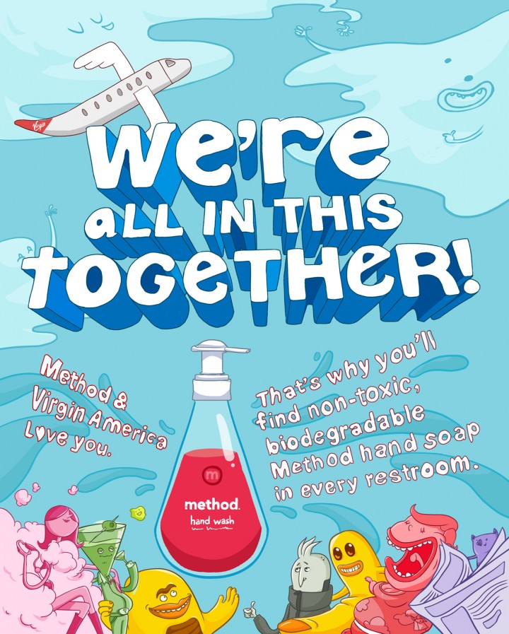
In this spot for Method Cleaners on Virgin America, 3LL joins forces with Droga5 to bring you a life lesson for easing your mind in the skies. So the next time you want to reach across the aisle and slap someone, take a deep breath and remember…“We’re all in this together!”
So Many Characters, So Little Time
This thing was LOADED to the brim with unique characters. We knew the key to this thing was going to be nailing those exaggerated stereotypes so that each character could make a huge impact without needing screen time. From the earliest part of the process, we knew we wanted to tackle all of the characters at the pitch phase. So we started drawing…
Many characters came and went, and we had to say tearful goodbyes to many of our favorites. But the final Method Virgin cabin was filled with an absolutely kickass motley crew of nut jobs.
Look and Feel
We felt pretty confident with our character control, but nailing the overall look and vibe turned out to be a little bit more challenging. Our initial exploration proved to be a little bit TOO candy colored and over the top. A quick re-adjustment and we were more on the money. Taking aesthetic cues from the Method website gave us a minimal grey and blue backdrop over which was sprinkled the occasional splash of vibrant color.
Finding the Story(board)
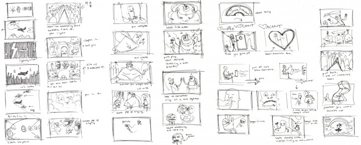
With the overall design aesthetic looking good and temp track in hand, we set about crafting the story. It was important to us that there be a sense of building momentum within the cabin. The “we’re all in this together” message needs to spread willingly from person to person, until everyone is unified in the end. We went from a super quick shitty thumbnail doodle-fest, to a more elaborate After Effects animatic.
Workflow Schmerkflow
At around the same time, we started bringing the animation muscle on board. We knew this thing needed a whopping dose of traditional animation, but the schedule and budget didn’t allow for full on straight ahead goodness. We had to improvise… and improvise we did.
The plan was to take one shot to final by the time we sent off the first pass animatic; show the overall foundation with a sample of polished goodness. The Loud Talkers shot seemed to have a little bit of everything needed to round out a typical shot. Here’s how we broke it down :
Layout : Every shot needs a multiplaned background to nestle all the characters in their seats.
BG characters : The focus of this shot is the FG characters, so BG chars just need a still.
The Loud Talker Ladies : each character would need a traditionally animated head. For their bodies, we’d create a layered PSD to build a parented AE rig for the character.
The middle dude : A simple traditionally animated facial take would be animated. That’s just the eyes and mouth as to save on drawing time. The entire body and nose would be a single piece of artwork.
Animation… In Photoshop!?
Our original plan: traditional animation in flash, still art in illustrator. Boy did that change. As we went through look development, everyone was feeling the wonkier hand drawn feel. Goodbye Illustrator. As we talked through the pipeline process with our new animator buddy Ben, he suggests “just do it ALL in Photoshop”. With a flurry of keystrokes, the animation timeline was opened, and we were animating… right there… all in one program. ZOMG.
It was a little slow at first, and the PS timeline is super NOT intuitive. But once you get over the obvious missing features, its pretty sweet. It definitely simplified our lives.
Not to spoil any secrets here, but we’re not doing anything particularly fancy in this project. The puppet tool was our greatest ally. As an extra bit of stylistic whiz bang (mostly to hide our limitations), we created a “2line” asset for every piece of art that was to be animating.
That means, tracing every piece of flat work twice so there’s a little bit of wobble in the line work. We held these alternating drawings on 4’s so it didn’t get too flashy. As we animated our parent/puppet tool rigs, we de-smoothed the animation so it held on 2’s to give it more of a limited animation look and feel.
Oh and here’s the proof of concept test.
Everyone loved the look. Success! At the end of the day, we think we netted out with a nice simplified animation style that combined the best qualities of traditional animation, with the best qualities of AE character animation, without sacrificing anything. That’s just our humble opinion. As with any project, once all of this was figured out, it was just a matter of plugging away and knocking out shot after shot.
We’re (also) In This Together
It was an absolute pleasure working with the extremely mega talented crew on this project. We reconnected with old pals, and made some new friends to be sure. Many thanks to everyone for their additions to the piece. And a big shout out to our wonderful interns who selflessly gave up their spring break to help us with the mountain of cleanup and fill work that needed to be done. Once again, we had a frickin’ blast.
Thanks to everyone on our crew, as well as the fine folks at Greendot Films and Droga5.


